Human-Computer Interaction: Design Remote Interactions - Zoom Re-design
Kinjal Shah, Kaiyu Shi, Erica Tevere
The goal of our project was to go through an end-to-end design process and apply techniques we have learned to improve or create digital services that facilitate remote interactions. Remote interactions include but are not limited to services in the realm of learning telemedicine, distributed collaborative work, and social connection. Drawing on our own experiences of online interactions, we looked into several possible ideas and selected the one we felt would have the greatest impact on user experience.
Brainstorming
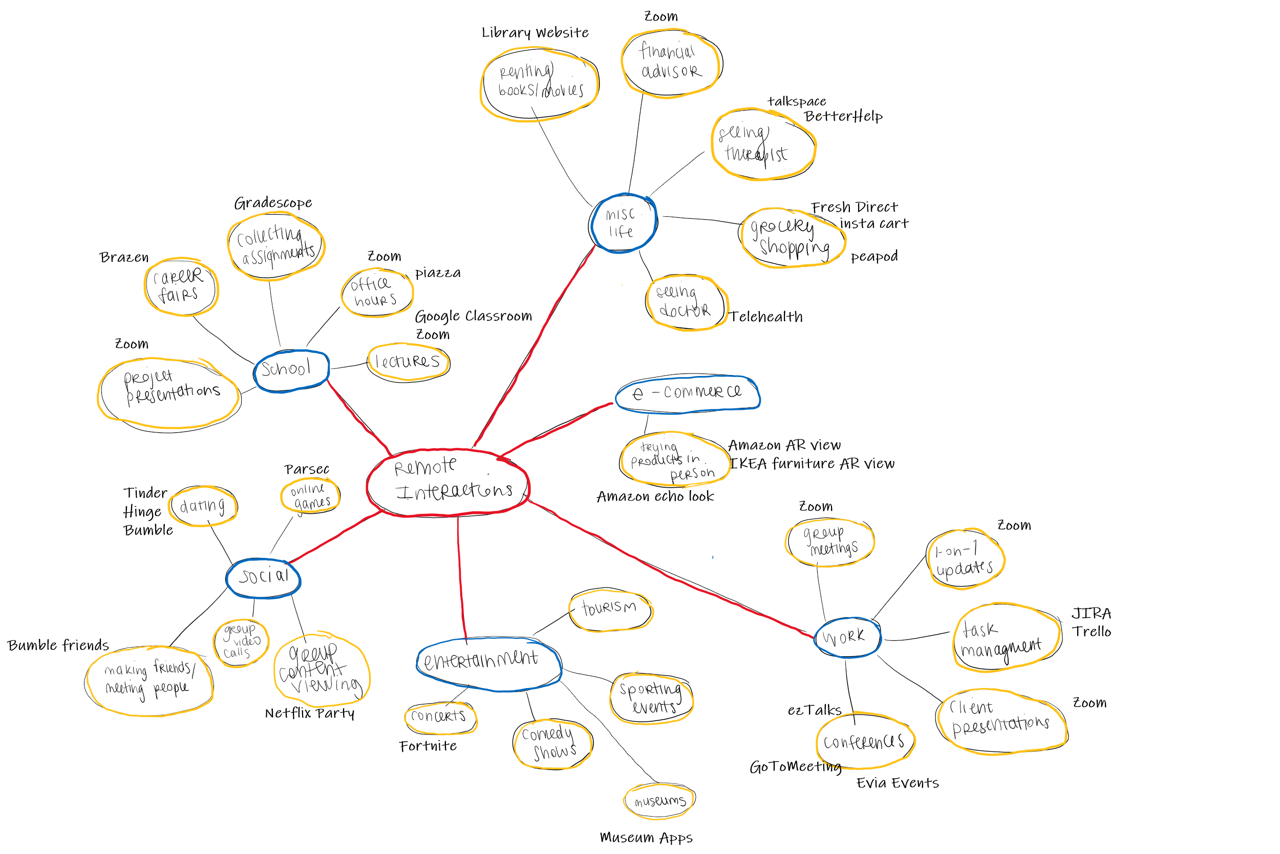
To begin our project we first decided to use some methods practiced in class to develop possible topics for the project. Our group used affinity diagramming to help think of different services to develop or areas to address in our project. The results of our session of speed iteration and brain dumping is seen below:
Affinity Mapping
Very Low-Fidelity Prototypes
After generating a wide variety of ideas to potentially address in our project, each team member selected one service that they wanted to develop further to get an initial understanding of what a potential interface for that service may look like and what kinds of problems we would be addressing if we undertook that service. As a team, we decided that services that addressed online office hours, online networking at conferences and other large events, and content viewing as a group would provide most added value to a potential user as these realms of remote interactions are currently lacking in-terms of a full functionality platform. Each member performed a very low-fidelity sketch of one of the ideas.
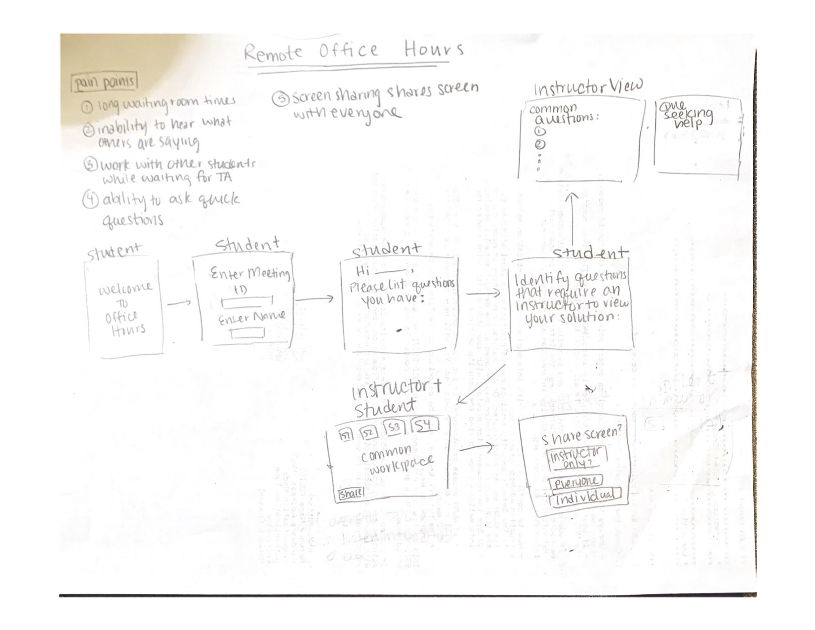
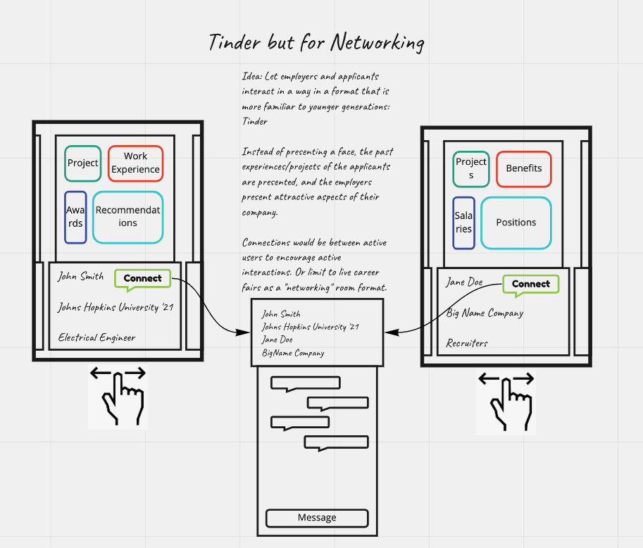
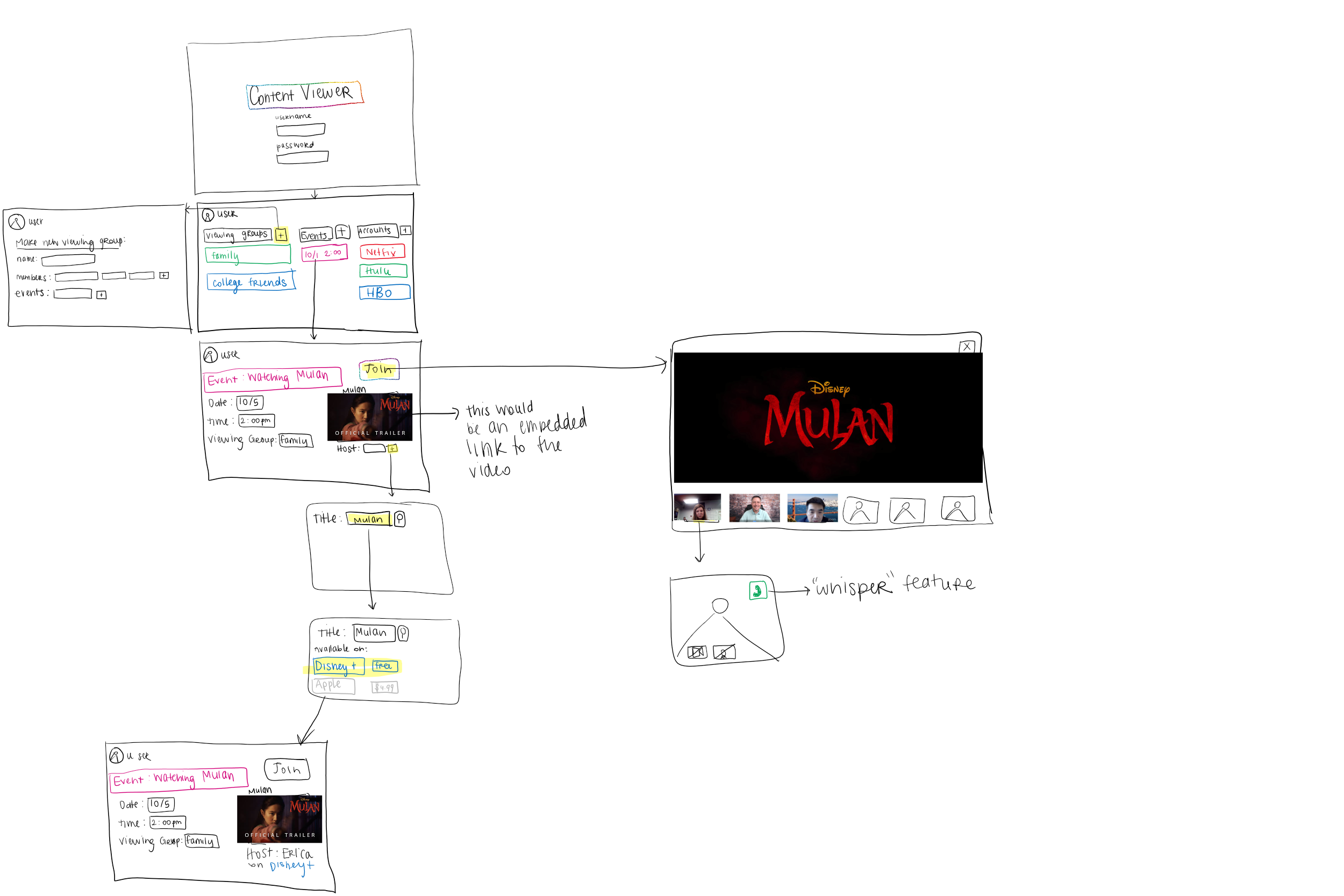
We asked our selected users to evaluate these paper prototypes to identify which would be most helpful in improving their day to day lives. After reviewing their responses, and discussion of the different mock-ups, our group decided to move forward with a project addressing an office hours interface as we all are current students in school and recognize the need for additional functionality in this remote interaction, and this sentiment was reflected in our target demographic user sample. Additionally, we think this is a service where redesign could have a significant impact on the user and greatly improve remote interactions for a large population of people.
Proposed Platform Redesign: Zoom for Office Hours
Zoom has become a major video conferencing platform for universities around the globe for facilitating remote instruction. While Zoom has begun to cater to the needs of remote instruction via additions such as breakout rooms, whiteboards, etc., it still falls severely short of student and instructor needs.
User Research - Diary Study: Event-Contingent Protocol
To understand how to best improve/create our platform for office hours, we first performed contextual inquiry into our problem. As students ourselves, we had a baseline understanding of how someone may need to use office hours and how some current platforms move the usual in-person interaction to a remote setting.
Target User Demographic
While Zoom is widely used by many demographics during this COVID-19 era, our primary user demographic are university students and teaching staff (instructors, teaching assistants, course assistants). Although as a group we covered both groups of users, we identified the need to perform further research into how this service is currently being used across a wider spectrum. Largely we understood that the experience may be different at different schools, for different courses, for different class size, and for different majors among others. To identify usability problems with current platforms we decided to do a usability study.
Diary Form and Result Links
Instructor/TA Diary - Responses
Rationale
In order to evaluate Zoom for Office Hour use, we needed to evaluate user experience during real office hours. Since office hours are relatively spontaneous events, and are individualized per class, it is not possible for us to observe users interacting with the interface without causing a disruption to the event. Furthermore, we did not necessarily need to observe how a user performed a given list of tasks, but rather we needed to understand how the user interacts with the platform to communicate with others. Therefore, the flexibility of the diary method enabled us to receive input from both teaching staff and student users.
Key interactions for TA:
- Start a meeting
- Speak individually with students
- Answer common questions
- Breakout rooms facilitation
- Whiteboard
Key interactions for Student:
- Join a meeting
- Share screen with TA
- Share screen with another user
- Discuss class material/problems with other students
- Join rooms
Results: Making Sense of User Sentiment
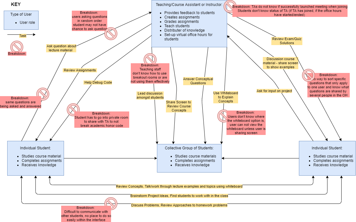
The results from our user study do indicate that there are several breakdowns with current platforms to provide effective interfaces for students and teaching staff to conduct office hours. Based on our results, although the general sentiment is that the current system is ineffective and often results in breakdowns when trying to replicate tasks performed in an in-person office hour setting, there is notable difference in difficulty and dissatisfaction for students over teaching staff. Perhaps this is because students are the ones who come in with higher expectations of what they expect to gain from attending office hours. This difference in sentiment can be seen in the graphics below. In user satisfaction, students felt satisfied with the office hour only 25% of the time whereas teaching staff felt satisfied with the office hour 50% of the time. In addition, all of the student responses indicated that they preferred in-person office hours whereas the teaching staff shared preference across the options.


These responses, along with the context provided by the remainder of the results in the diary user study indicate many breakdowns occurring, with student users having an especially difficult time navigating the interfaces and get the help they need and expect from office hours.
Results: Flow Model
We chose to use a Flow Model to interpret our results from the diary study as the Zoom platform is primarily a communication tool. Therefore, we needed to better understand how communications of different forms happen in order to understand how to best improve the application. For this reason, a flow model was more appropriate for our evaluation than a sequential model.
Results: Sequence Models for Key Tasks
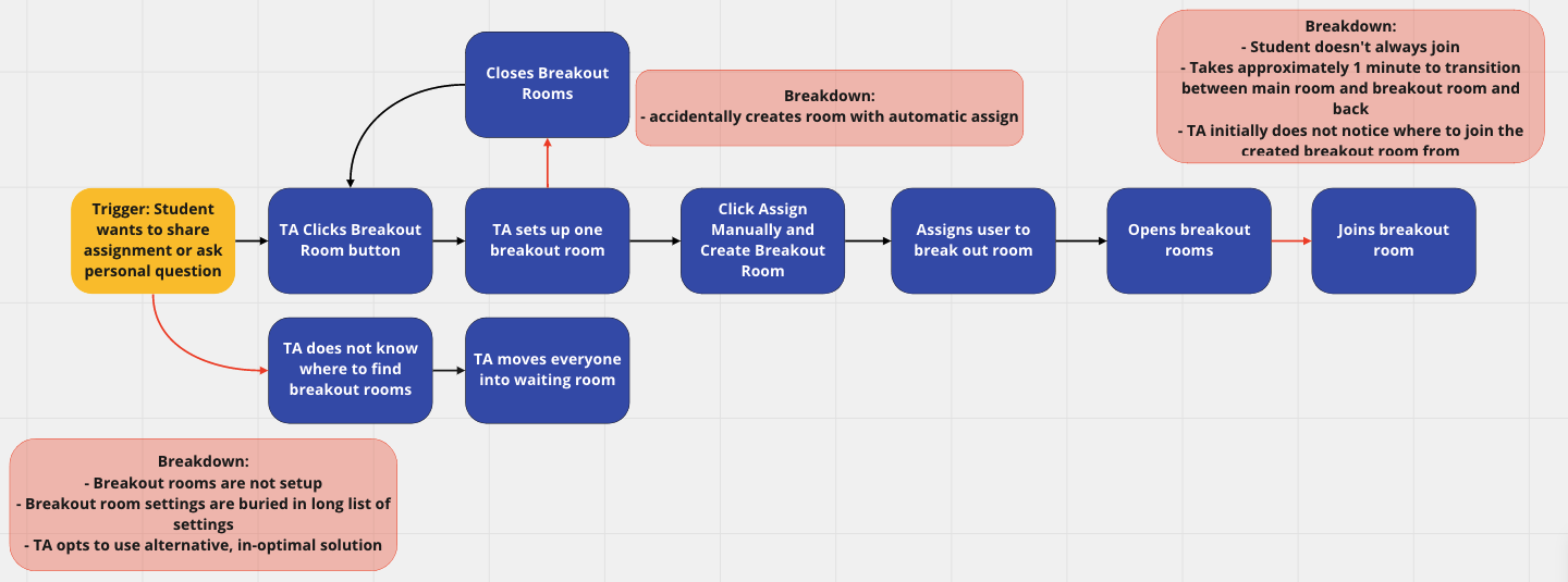
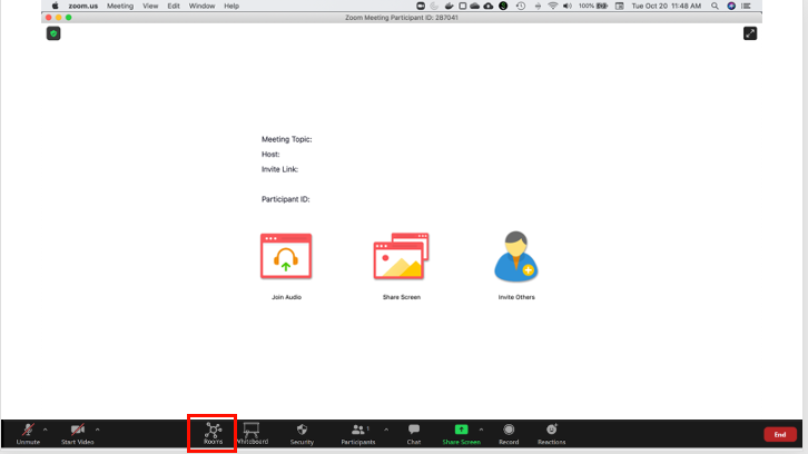
While the majority of our observations were about communication pathways using Zoom as a platform, there were a few key tasks that we were able to perform contextual inquiry and sequence modeling for. For some of these tasks, to ensure that we were developing robust solutions, we performed paper prototyping when possible before we further iterated on the more interactive prototype used in the user evaluations below.
Sequence Model
Paper Prototype

Results: Primary Sources of Breakdowns
- Screen sharing is to an entire room, therefore students need to be put into private breakout rooms to share their screen if there is sensitive information (i.e. code)
- Breakout rooms need to be activated, many students and instructors do not know how to use breakout rooms functionality
- When joining a meeting, TA’s do not know if they have successfully launched the meeting
- When joining a meeting, students do not know if the TA has joined the Office Hours, if they are in the right office hours, or if the office hours have started/ended
- Students must use other platforms, e.g. be on phone in addition to joining zoom, if they would like to work with other students while also joining office hours
From Breakdowns to Design
Results and context gathered from the user study allowed us to begin to develop the design of our solution. After we reviewed the results from the user study for both the student group and the teaching staff group we had a discussion about how to best address breakdowns identified and existing in current office hour platforms. For each of the breakdowns we came up with a couple of options on what kind of solution may address the problem. Additionally, we discussed what an interface for that functionality may look like, if something that has similar purpose already exists within the interface, and what may be the most intuitive solution for the user when navigating the new features. Our affinity diagram for idea generation to address each of these breakdowns can be seen below:
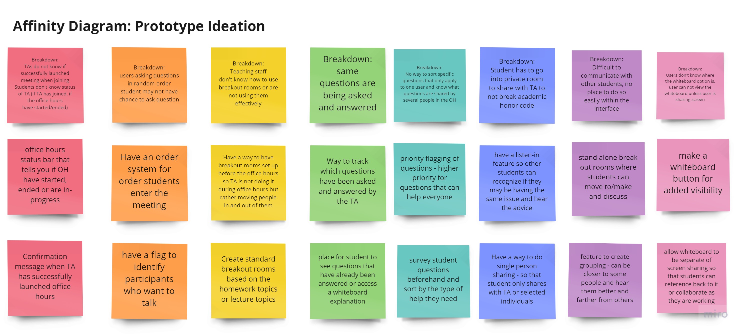
With initial ideas of the features that we wanted to implement to address each of these breakdowns we were able to go into the design process with rough drafts of what each feature should look like. Using an iterative design process, we were able to develop, discuss, and adapt each of the added features. The final converged designs for our initial prototype are explored more in the next section.
Design Adaptations to Address Breakdowns
Rooms View
In the current state, only instructors can setup breakout rooms. Many instructors do not know how to setup break out rooms. Leads to breakdown and the instructor ends up keeping all students in the waiting room. Additionally, our user research led us to discover another breakdown surrounding student-student collaboration. Students are currently unable to do so as they are either in the waiting room or listening to the TA answer another student’s question. Many students reported not knowing other students in the class to work through problems and course concepts with, which leads to increased demands on the instructors. Thus to address these breakdowns, we introduced the ability for students to create breakout rooms.
We have redesigned the Zoom interface to have an interactive “Rooms” tab, where users can more seamlessly view where the TA is and discuss with other students based on topics. The TA has the additional functionality to create private breakout rooms to which users can only be assigned by the TA following the existing break out rooms assignment process.
Instructor view on the left, student view on the right. Both students and instructors can create breakout rooms. Only instructors can make private break out rooms.

Pre-Office Hours Questionnaire
During our user research, we found that TA’s often struggle to address everyone’s questions in the limited amount of time, and often repeat the same recommendation to many students who all have the same question.
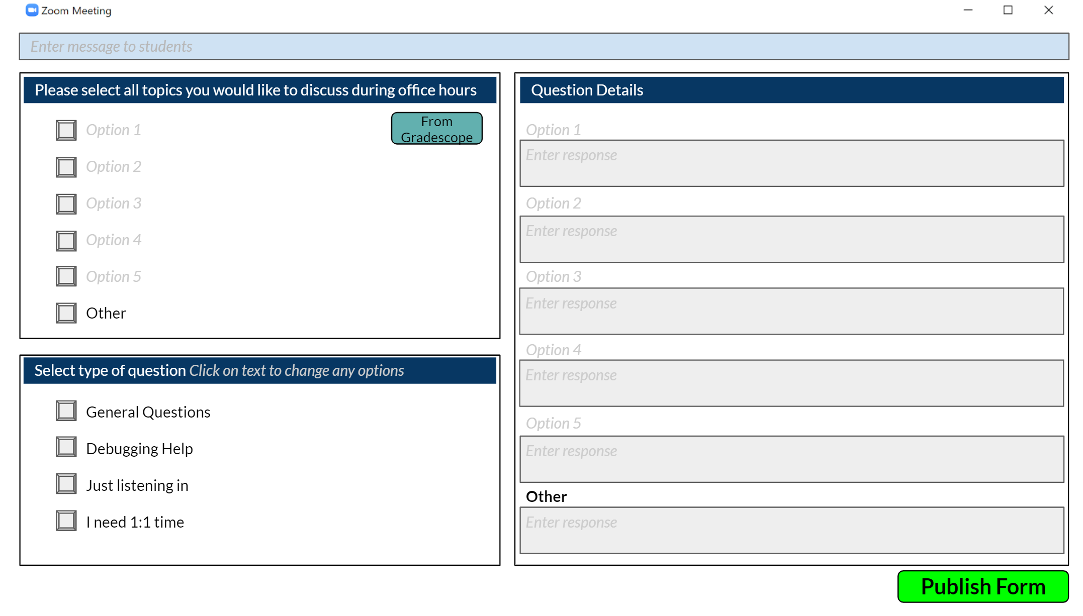
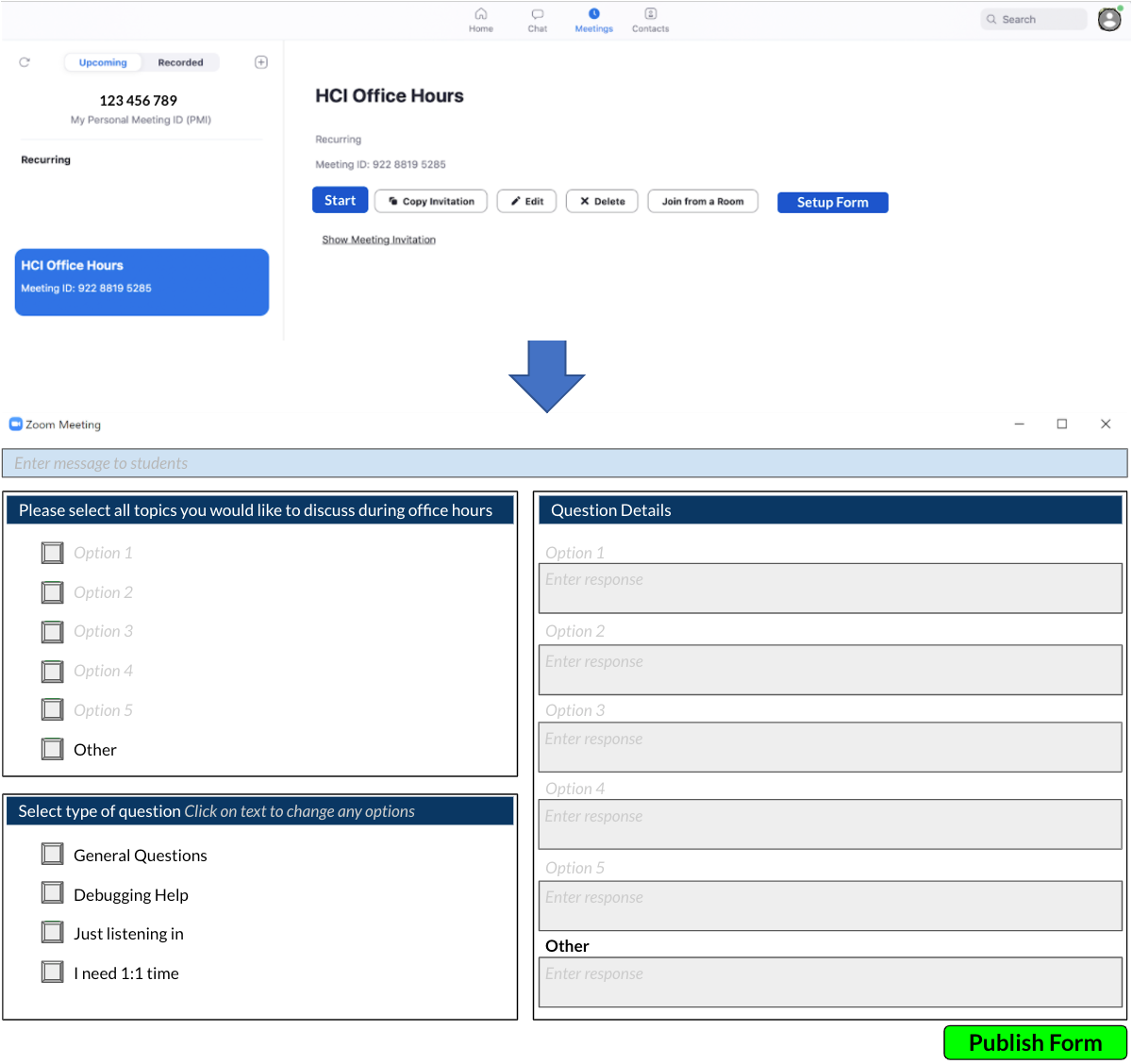
To address this breakdown, we propose the Pre-Office Hours Questionnaire. Open for 30 minutes before office hours. Students will be able to submit what homework problems they have issues with as well as the type of question they have. TA’s will view the results when they begin their office hours, and will be able to create break out rooms related to relevant questions. Students can then join these breakout rooms to interact with other students while waiting for help. Additionally, the TA can view the types of questions people have, and structure their time accordingly. Lastly, using state of the art NLP methods, the submitted form will be analyzed and the most common questions/key words from all user submissions will be analyzed to give the TA a summary of topics that they should focus on.


Office Hours Status
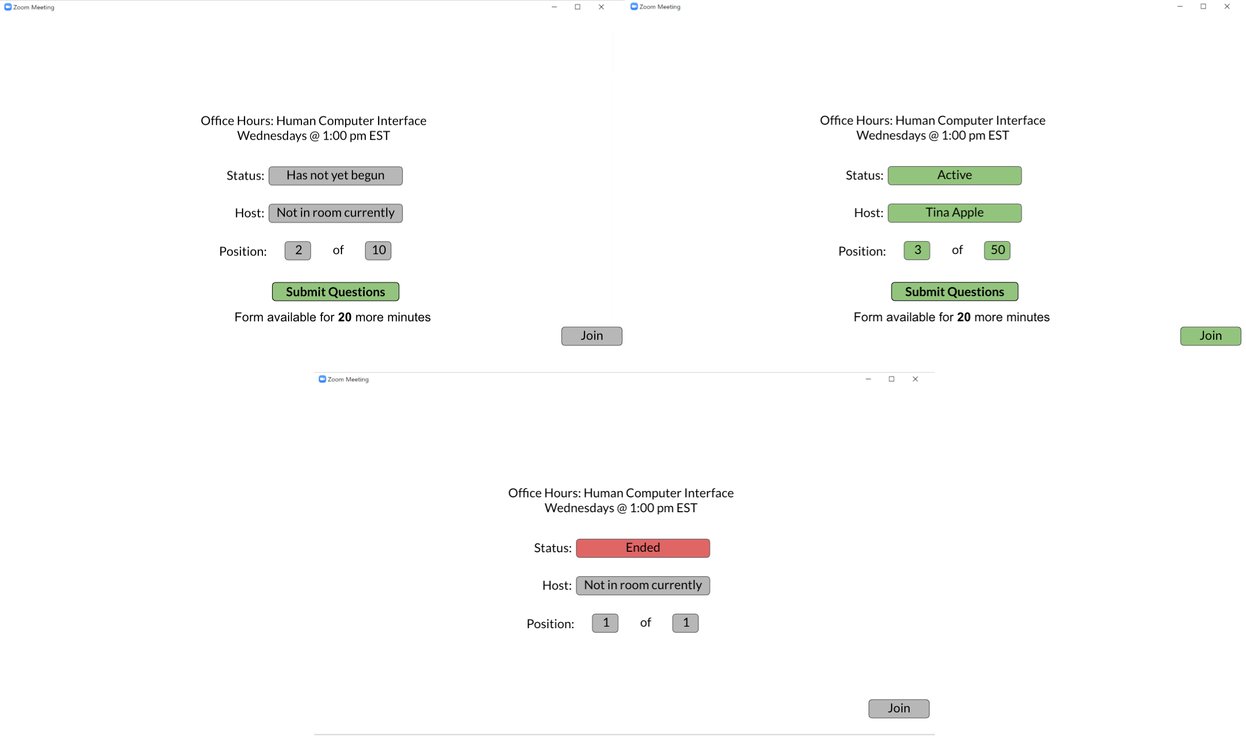
Surprisingly, we found that both students and TA’s often wonder whether the office hours are active and whether they are on the right link. This leads to a breakdown of closing out of zoom and tracking down the link a second time to confirm they have the right one, or students emailing the TAs to check whether office hours are occurring/in progress. Therefore, after joining the link, we have added a landing page where users can see the status of office hours as well as their place in line if they are a student.
Student Queue for TA
A breakdown we observed is that TA’s lose the order in which students join when they admit students into the meeting. Thus, may TA’s keep students in the waiting room so they can see the order in which they joined. Additionally, TA stated that they spent time with students who were only interested in listening in to the office hours, which increased overhead of the office hour.
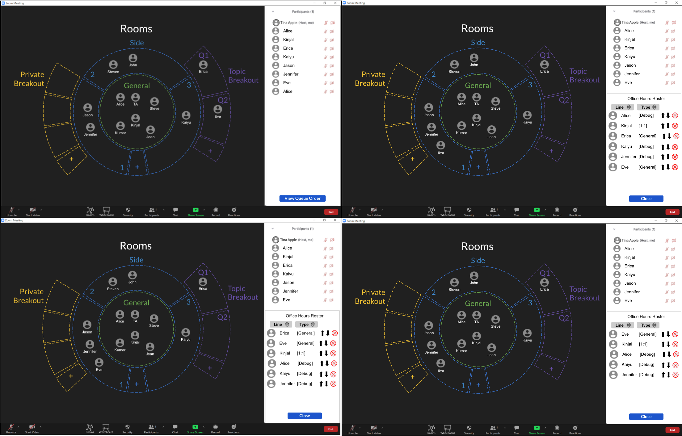
To address this breakdown, we propose an Office Hours Roster/Queue. TAs can view the order in which the students joined, as well as the type of question they have (e.g. 1:1, general, just listening in, etc). Students who are just listening in, will not be included in this schedule view. Only students who have requested 1:1, debugging, or general will be listed. The TA can customize how this is ordered (e.g. general questions first, debugging/1:1 last).
Share to all students from breakout room
We found that many students attend office hours in order to learn from others. They often stated “you sometimes don’t know what you don’t know, until you hear other student’s questions.” Likewise, TA’s found that they were often answering questions multiple times across students.
To address these breakdowns we propose the “Share to All” and “Listen In” features. These features allow the TA to share content with the whole office hour session if they decide it may be helpful for everyone. Similar to one person asking a question at in-person office hours and the TA addresses everyone in attendance.

The student will be able to decide whether to listen/view the content that the TA is sharing.

Make Whiteboard More Accessible
Zoom comes with a whiteboard and annotation features. But most users did not know that this feature exists. Therefore, in our redesign we have made it more prominent. In zoom’s current interface, the whiteboard feature can be shared by a user for other users to view and annotate, but when the user switches to sharing a different screen, this whiteboard is no longer visible to other users. This is non-intuitive for a format like office hours where users may want to collaboratively contribute to a derivation or switch between the screen showing the assignment and this whiteboard area. In our redesign, not only is the whiteboard feature now more visible to users, but it also stands on its own, specific to each room in the meeting. This gives users a chance to use a white-board as they may in-person as more of a space to collaborate and share visual ideas that they can easily go back and forth to as they are referencing other views in the meeting.

Prototype Evaluation
User Personas
User 1
Age: 26
Gender: Male
Occupation: 5th year PhD student in Computer Science
Level of platform use: High, daily use User Role: Student, TA
User 2
Age: 25
Gender: Male
Occupation: 4th year PhD student in Mechanical Engineering
Level of platform use: High, daily use
User Role: TA
User 3
Age: 26
Gender: Female
Occupation: 2nd year Masters Student
Level of platform use: High, daily use User Role: Student, TA
User 4
Age: 23
Gender: Female
Occupation: 2nd year PhD student in Biomedical Engineering
Level of platform use: High, daily use
User Role: Student
User 5
Age: 23
Gender: Female
Occupation: 2nd year PhD student in Biomedical Engineering
Level of platform use: High, daily use
User Role: Student
Prototype Evaluation Videos
Prototype Evaluation Tasks
- Please join a zoom session as you would a student.
- Please enter your meeting id and join the meeting.
- Please submit some questions for the TA.
a. Select Problem 3, Lecture Material for topics.
b. Select Debugging Help and Just listening in for type of question.
c. Enter information for the corresponding topics you selected and click Done. - Now that the Office Hours is Active, join the session.
- Please join the general discussion room.
a.Listen in on the breakout room shared by the TA
b. End your listen in
c. Navigate back to the rooms overview - Move to the second side room
a. Open the whiteboard
b. Close the whiteboard
- Please join a zoom session as you would a host.
- Since your credentials are already entered, sign in.
- Setup the form for your Office Hours session
a. Click anywhere to setup your form.
b. Click Publish Form. - Now that it is time to begin your Office Hours, click start.
- Choose to open breakout rooms for all questions.
- Click Done to open the session to students.
- Join Erica in Breakout Room Q1 to help her with her programming issue.
- You feel the whole class should have an opportunity to see your solution to this common issue. Let the rest of the students have the option to listen in.
- End the Listen In sharing.
- Open the Rooms overview.
a. Open the participants pop up window.
b. View the Queue Order.
c. Sort the roster by Type
d. Remove the student Erica from the roster since you already helped her.
e. Close the roster - Click and drag Eve from Side Room 1 to Breakout room Q2 to help her with her problem.
User Evaluation
Positive Feedback
User 1: Found the new prototype to be a significant improvement over the existing platform. He found the overall “rooms” view to be far more interactive, and as a TA appreciated the ability to organize the office hours in cases where there are many students. His favorite part of the new platform was the share screen with everyone feature and is excited to see this implemented in a high fidelity prototype. The user was confused at first by the interaction with the Rooms view, as this has not been a part of video conferencing platforms, but he noted that he has used such interfaces as part of interactive video games, and thinks this is a great addition to a Zoom-like platform.
User 2: Thinks the room system can be very useful for both TAs and students. For TAs it would allow them to sort out the students that need different kinds of help, and the Listen In feature could be useful as well. For Students it would allow separation into groups, which can assist with collaboration.
User 3: User 3 is very familiar with the zoom platform from both a TA and a student perspective. As a student, User 3 is most frustrated by long wait times, and so felt that the pre-office hours form and the ability to meet with other students in the meantime was most helpful. Since user 3 does not know many people in one of her classes, User 3 felt that the topic wise breakout rooms would be a great way to meet other students. Additionally, user 3 loved the ability to return to a whiteboard even once it was closed. As a TA, User 3 felt that the form integrated with the breakout room functionality was the best part of the redesigned platform. However, as discussed below, she also felt that it is still a bit rough. She also felt that the listen in and the share with all features were a great step towards recreating in person office hours.
User 4: User 4 is familiar with the zoom platform from only a student perspective. User 4 thought that although initially a bit overwhelming, the set-up of the rooms interface made a lot of sense and that the circular view of the room was intuitive over some other format. User 4 specifically mentioned that she could not see it being a more linear format. User 4 felt that having used the interface just one of two more times, she would have no issue interacting with this feature to its full extent. User 4 liked the added visibility of the whiteboard application and liked that she did not have to search through menus for it.
User 5: User 5 is familiar with the zoom platform from only a student perspective. User 5 really liked the interface and felt it was easy to navigate. User 5 also felt an interface like this would make office hours more enjoyable to attend and the features added would make attending office hours less stressful and motivate students to seek help when they need it.
Areas to improve
User 1: felt that it was not fully clear how to interact with the new interface and existing zoom functionalities. In a future iteration with a high fidelity prototype, we would look to improve the full extent of the zoom functionality along with the new designs. Additionally, the user felt that the forms view could be more refined to provide more insight to the TA. The user felt that this new interface still does not address the problem of people talking over each other, and it would be great if some type of notification mechanism and pose detection could be used to better understand when individuals want to speak. Additionally, the user felt that the listen in and share with all features could be made more intuitive. As they currently are in the low-fidelity prototype, it is not immediately evident what these functionalities provide.
User 2: would have liked to see more general topic options for students. Was confused about the functionality of the side rooms; needs to demonstrate its purpose in a more intuitive and obvious manner. Would like to see some sort of wait time indicator/time slot system for students’ questions, as determined by the TA. Lastly, a notification for the TA when a big group joins the office hour can be useful.
User 3: User 3 felt that the need to set up a form for every office hour would be very time intensive for the TA/instructor. Though she acknowledges that this form may also save them more time than it would take to set it up. However, given that most assignments are now on Piazza/Gradescope, she said it would be amazing if there was some way these could be integrated in order to make the form generation more seamless. Additionally, she felt that the whiteboard app could be even more prominent within the application.
User 4: Although user 4 liked the set-up of the rooms interface, she did not understand what the set of side rooms in the interface accomplished and did not feel like users would understand how to use them based on interacting with the feature.
User 5: User 5 felt that although accessing the whiteboard was a lot more visible and accessible in the current interface that it would be helpful to be able to see the whiteboard and the general screen at the same time as it would allow for easier collaboration especially when people are trying to work collectively based on the same document.
Further Iteration and Prototype Refinement
Although user feedback from all 5 user tests performed were largely positive and identified the prototype to have added significant value to the online office hours experience, we did recognize that there are definitely areas to improve. We integrated some of the user feedback from the five prototype evaluations that were performed to make certain aspects of the design more intuitive to access and easier to use. Although we did mock up these iterative changes in our prototype, further prototype evaluation would have to be performed to better understand how these changes affect the user experience. We would continue this process of iterative prototyping and evaluation until we felt we were at a point where the user design was streamlined enough and to begin implementation and integration into the system.
Making the Whiteboard Feature More Prominent
In our initial high-fidelity prototype we addressed the issue of making the whiteboard feature more visible and useful for collaborative efforts between students and teaching staff by allowing it to stand-alone from the screen-sharing capabilities and making it specific per zoom room. Taking into consideration user feedback that suggests making the whiteboard feature more prominent and visible with other screens, the prototype was changed so that when the whiteboard button is selected from the menu the whiteboard application only opens into a split screen instead of taking up the entire screen. This should allow for additional collaboration as now users may continue referencing a screen or seeing someone’s video feed while also making annotations to or viewing the collaborative room whiteboard.
Easier form generation
In our initial high-fidelity prototype the teaching staff had to use the form set-up page to generate an office hours question form where users are able to submit their questions and other useful pieces of information right before the office hour begins. Users who interacted with the prototype felt that this feature was a great way to collect information on what kinds of questions people have and get a sense of what needs to be addressed at large during the office hours. In addition, the data collected on the forms may also be used by teaching staff to better understand how people are using their office hours and what portion of the course is causing the most difficulty. Although the addition of the form is seen as useful to the users, some user’s did note that it does provide additional work for the teaching staff which is unfavorable. One user mentioned that it would be great if there was a way to integrate with submission platforms like Gradescope. As such, we added an option to import questions and question details on the form from Gradescope. This should be easy enough to integrate if the assignment is set up in Gradescope as Gradescope has the option to separate by question (which is used in tagging questions during submission) and so the assignment should already be separated in a way that is intuitive for processing during office hours.
